A new user-friendly home that embrace business.


Overview
Getting started
To comply with my non-disclosure agreement, I have omitted confidential information and oversimplified this case study. All information is my own and does not necessarily reflect the views of Guiabolso.
Guiabolso is Brazil's largest financial management app with over 7 million users, available on IOS, Android, and browsers. It integrates with major banks in Brazil, allowing users to view all transactions in real-time, in one place, for free.
Note: On July 2021, the startup was acquired by Picpay, a digital bank with over 66 million users, to play a leading role in the new Open Finance landscape emerging in Brazil.

Overview
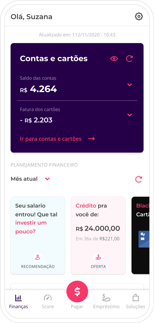
With a focus on enhancing app monetization for the sought-after breakeven or startup sale, our team inherited the home, the company's paramount conversion space. Our mission was to refine and revamp the user experience to align with the company's new phase.
The new home version was a culmination of various learnings, analyses, refinements, and validations, meticulously crafted to cater to business needs without compromising user well-being and objectives.
Product Strategy
Experience Design
Visual Design
User Interviews
Behavioral research
Prototyping
Understanding the Past.
After solidifying its position as Brazil's largest financial management app with 7 million users and confirming user interest in financial products through the loan marketplace, the startup was ready for the next step.
Entering Scale-Up mode in pursuit of breakeven, we expanded our financial product portfolio, adding partners for digital accounts, credit cards, insurance, and investments.
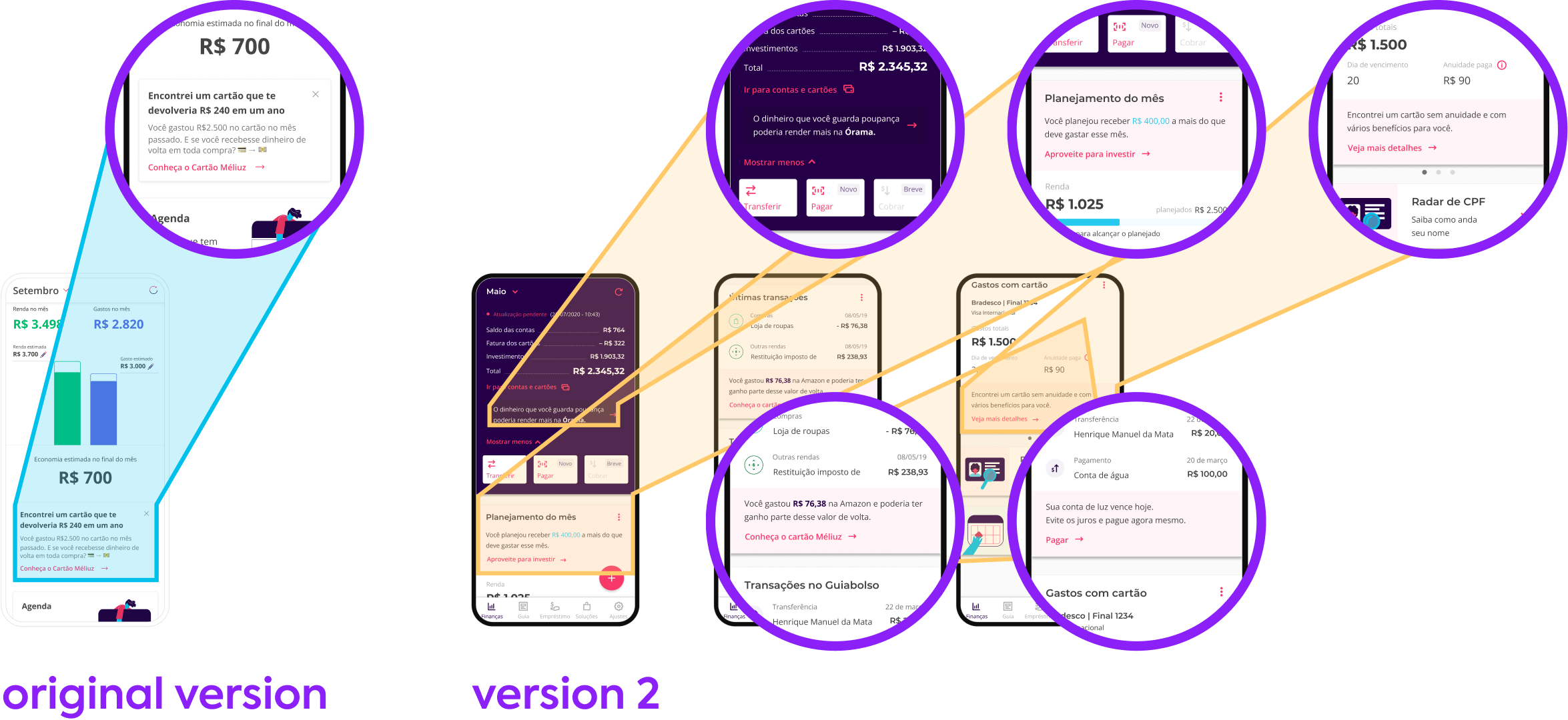
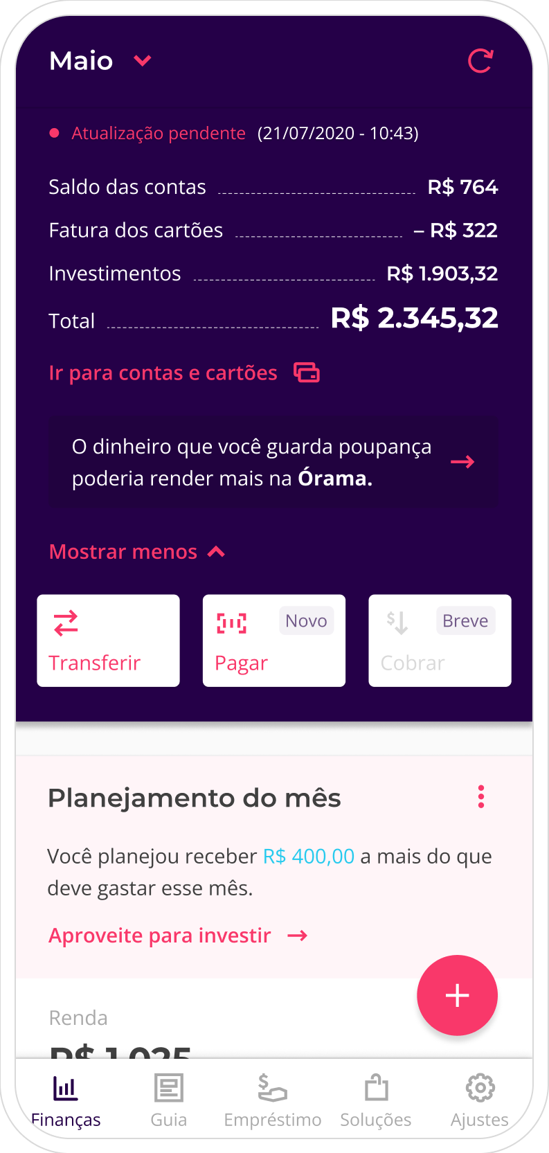
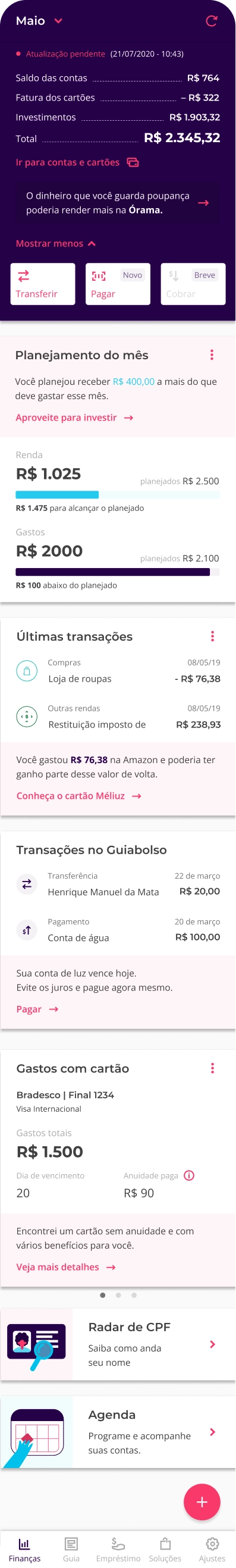
The existing home no longer met the startup's current needs. There was only one offering space on the home page, which boasted a 62% higher conversion rate than others, leading to internal disputes as only the team utilizing the space for the month could meet the target.
Of Good Intentions.
To scale app monetization and resolve internal conflicts, senior management commissioned a new home designed to have multiple offering spaces.
A proposal featuring 5 new offering spaces, following the previous formula. The conflicts ceased, and clicks on offers tripled. However, after 6 months...
Solving the Problem by Creating Another.
After 6 months:
- The new monetization spaces did not perform as expected (number of clicks on offers tripled, but total conversion reduced by 8%).
- Our ratings on the Apple Store, Google Play, and NPS dropped by 0.2 (due to increased complaints about "advertising" and "visual pollution").
- MAU dropped significantly every month.
- New user churn rate increased to 80% (a metric analyzing app return after the first use in X time).
Note: ⚠️ We faced a 90% dropout problem in the registration stage due to the necessity of sensitive data for account connections. The user acquisition cost was high, reaching R$ 50 (U$ 10) per new user, making losing these users costly for the company.
The challenge.
After delivering the credit score, my monetization team inherited the home during a company restructuring. My task was to introduce a new version that embraced the business without compromising the user experience.
The challenge remained the same as the original version: ensuring more offering spaces, but this time addressing the problems the version 2 brought.
If You Stay Ready, You Don't Have to Get Ready.
All usability tests and in-depth interviews from the last 6 months provided insights about the home. It was a substantial volume of qualitative data to cross-reference with quantitative data and initiate the investigation.
This extensive data saved us a considerable amount of precious time.

The Big Picture.
Analyzing qualitative data about the home:
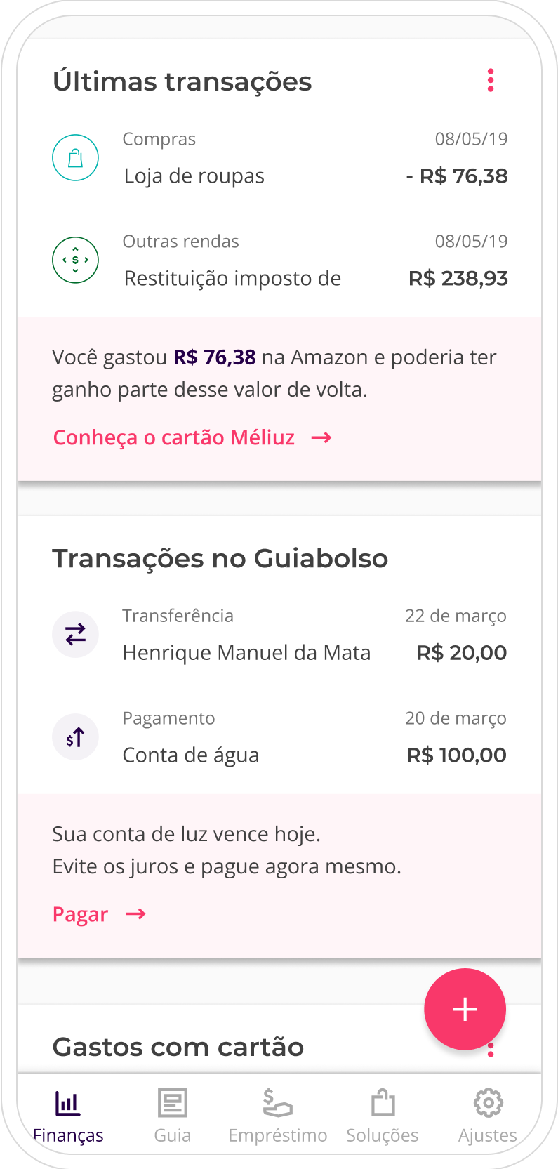
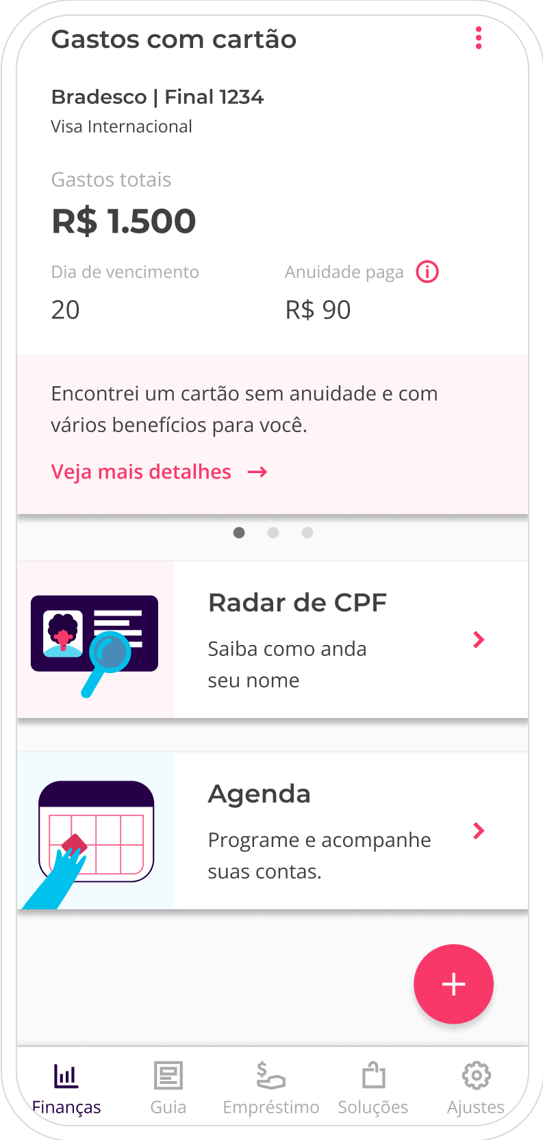
- The abundance of advertising generated discomfort, noise, and tended to be ignored.
- Usability was complex and confusing, compared to the previous version.
- Users expected to see insights about their financial life with their data and were frustrated with generic information, offers, and tips.
Analyzing quantitative data:
- The number of clicks on offers tripled.
- Real conversion dropped by 8%.
- We experienced a loss of 30% of total MAU (calculated by active new users minus those who left the app).
- The new user churn rate increased from 45% to 80% (a metric analyzing app return after the first use in X time).
- 40% of total tickets were related to complaints about "too much advertising in the app."
I formulated the following theories connecting both data:
- Our users considered any generic offer as advertising and insights as those tailored to their data.
- The increase in clicks on offers was a side effect of confusing usability, resulting in mis-clicks.
- The increase in usability complexity led new users to give up, and our MAU leaves the app.
Note: Many other complementary data, insights and theories were removed from this case study to simplify and get straight to the point.
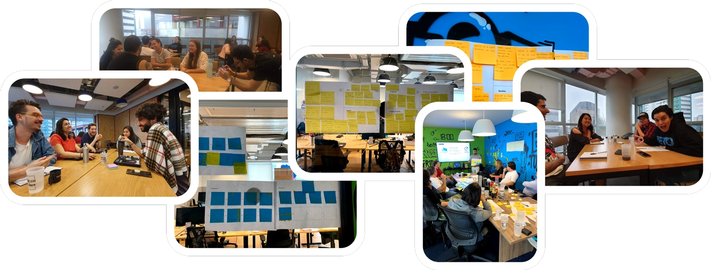
Triple Checked.
To ensure we wouldn't repeat the same mistakes as in the past, I conducted two ideation sessions, one with the design team and another with the product team and stakeholders, to gather and centralize all internal knowledge and learning.
Based on previous ideations and analyses, I condensed everything into a prototype to be tested with our users, with the support of the research team, to gather qualitative insights. There were 22 usability tests, in each new test we iterated the prototype, which generated approximately 14 different versions with the perceptions and feedback collected by our sample of users.
Note: Throughout the process, constant checkpoints were made with the development team for alignment, understanding technical complexity, and legacy code that should be taken into account in the project.
Design
A New Perspective.
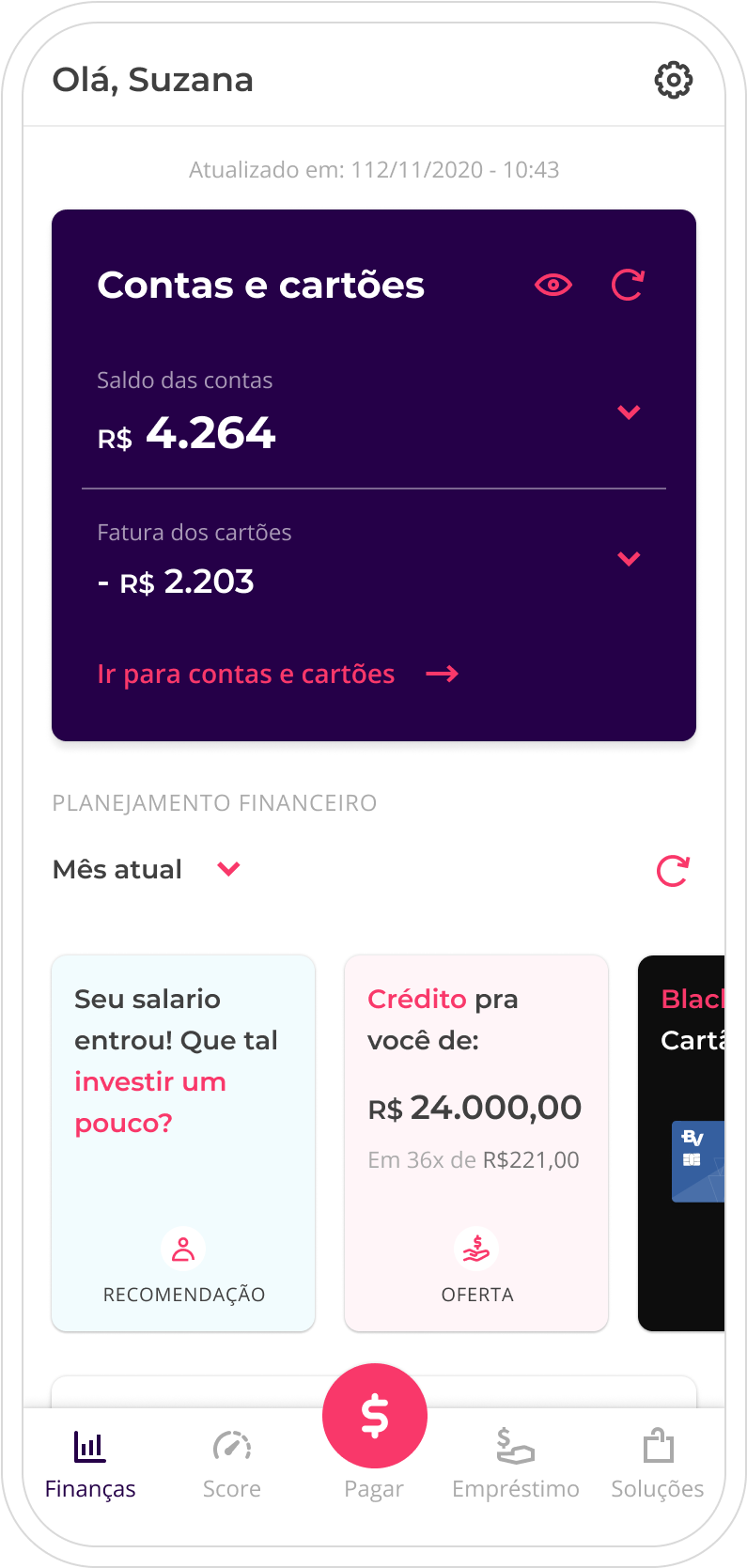
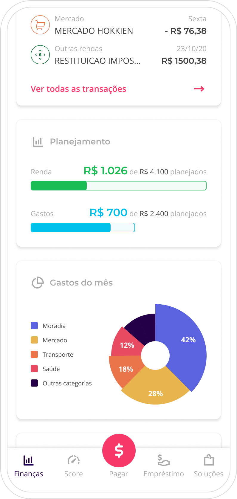
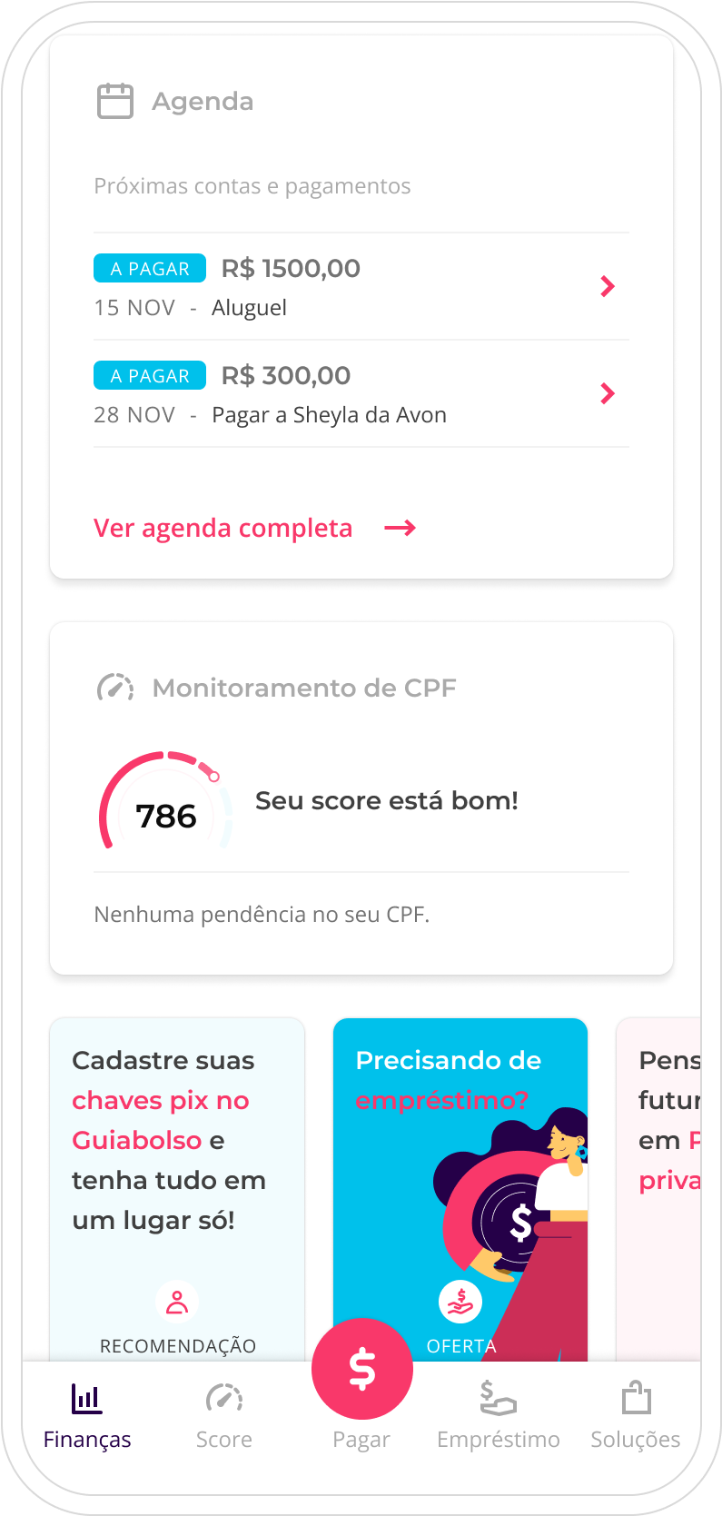
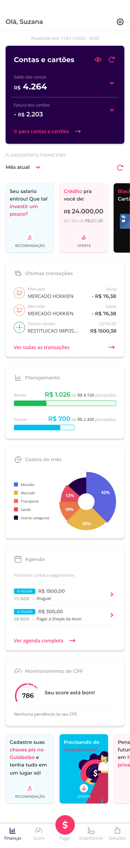
The final and refined version was a delicate balance between the first version of the app, simpler and focused on financial management, with a new look for offers and financial tips. All based on data and analysis.


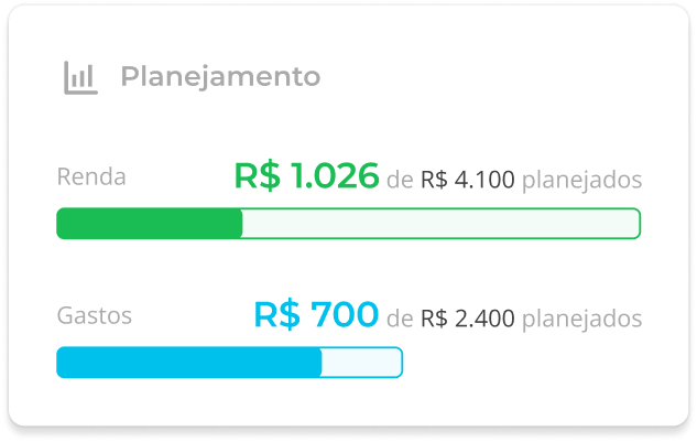
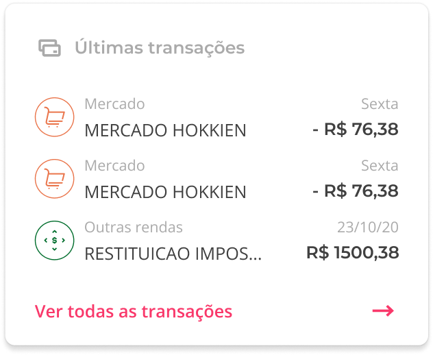
Personalized and Meaningful.
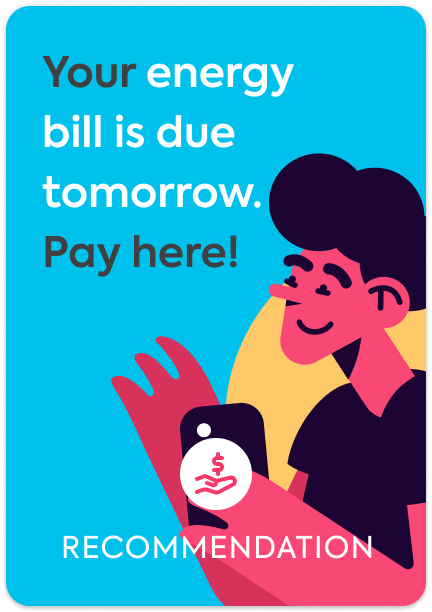
The new look of offers was designed to be flexible, allowing the use of visual reinforcements or just text, as before. To generate identification, it prioritized offers and financial tips tailored to user data over generic ones. All this without causing major disruptions in the app's navigation.
All based on data from the product and market team:
- Visual offers convert 2x more than text-only.
- Personalized offers convert 32% more than generic ones.
Note: Offers tailored to user data are more expensive and difficult to make. Therefore, the offers needed to be very flexible to also receive generic offers, and make them more attractive. This was a learning from version 2.
Breathable.
Dealing with financial life can be burdensome and complex; any distraction, uncertainty, or insecurity can be the last straw to make the user give up and abandon the app.
The proposal was planned to have the least cognitive load possible, directing the user's perception, separating and combining elements with gestalt principles for a better understanding and scanning by the user.
Simple and direct.
Fail Fast and Learn Fast.
Even after rigorous risk management with internal and user validations, the only way to legitimize our hypotheses, in a statistically valid way, was in production. Therefore, the proposal was phased in 3 stages to ensure we would test quickly and with the lowest development cost possible.
In case of errors or problems in the proposals, it would be cheaper and simpler to adjust or revert.
Results
We reduced the churn rate in the first use from 80% to approximately 50%.
Over three months, we observed an 8% increase in conversions from the home with the initial tests, a surprising result considering the click-through rate on offers dropped by 50%.
In the following three months, we experienced a significant decrease of approximately 80% in complaints through reviews and NPS about advertising and "visual polution". As a result, we were able to recover the store rating to 4.6 (an increase of 0.1) due to the incredible work of the CX team.
Learnings:
- User perception of advertising versus insight depends on how we construct and use their data in offers.
- Usability issues and visual hierarchy problems can generate vanity metrics, such as the tripled click-through rate on offers, while losing total conversion in v2.
- Financial management is a complex subject for our users. They tend to respond better to navigations with less text, simplicity and visual reinforcement.
Already known but reinforced:
- Financial management is a dense subject; any barrier and insecurity are reasons for user abandonment.
- Contextualized offers with data convert more.
- Offers with visual reinforcement convert more.
Note¹: ⚠️ It was not possible to deeply analyze the impact on the monthly active user rate due to the acquisition of the startup by PicPay.
Note²: The new homepage was a big effort to make the app more appealing to potential buyers.